Wanting to bring a late 1980s time capsule of a kitchen back to the future, this White Bear Lake area homeowner was able to achieve a space that is modern, homey and welcoming. Before, it was an all-too-familiar scene, an original kitchen with honey oak cabinetry, red oak floors, deep brown walls, short cabinets, popcorn ceilings, a built-in desk, an electric ivory stove and a peninsula that divided the dining space from the kitchen. The entire space was in dire need of an update. Though the yawn-inducing appearance of the original kitchen was reason enough to begin a remodel process, it all came down to that u-shaped layout created by the peninsula. With five grandsons, this kitchen had grown too crowded and didn’t make sense for an extended family lifestyle. The kitchen felt cramped and cluttered and lacked good traffic flow. That said, there was also lot of wasted space and potential.
With a goal of creating a more desirable gathering space, the homeowner wanted to address three essential objectives: Decrease clutter to improve traffic flow, update aging appliances and brighten the space with color and more natural light. J&J Remodelers, a Minnesota based full-service design and build remodeling firm, was able to transform this disconnected space into a more cohesive modern retreat. “We brightened it up, we opened it up and we modernized it,” J&J Remodelers Interior Designer and owner of SubtleRefinement LLC Judy Otting says.
Otting says the homeowner came prepared to the first design meeting knowing exactly what they wanted and were very involved throughout the whole process. Researching a variety of styles, materials and layouts prior to the design process, the homeowner created a series of digital vision boards and organized digital folders of preferences as inspiration. Modern tools and internet functions make renovation research easier than ever so that most homeowners can more easily provide designers with a sense of their ideal space.
“She knew exactly how she wanted her space to look so it was really easy to work with her,” Otting says. “I really appreciated that decisiveness because it helped me create a space that fits them.”
Understanding clients and what they want is a major part of the business Otting says. Despite the fact that some may not be familiar with the logistics behind certain processes, Otting says that if one thing is for sure, people typically know what colors and shapes they prefer whether they realize it or not. “Everybody really is their own decorator,” Otting says. “[For example,] if you show someone a purple carpet and follow it up with their opinion, they really do have a sense of what they want and what works for them and their aesthetic.”
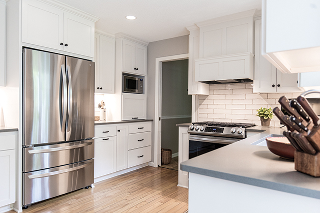
In this particular project, the homeowner decided to steer clear of creating a stark white space that’s become common in many modern kitchens. Instead, they opted for earthy neutrals and warm grays to add color variation and soften the space. With the only remaining element from the old kitchen being its rich oak floors, everything else was replaced in order to achieve the desired aesthetic. “For me it is creating that space and helping their dreams come to fruition and working and guiding them through that process,” Otting says.
DESIGN FEATURES
Island
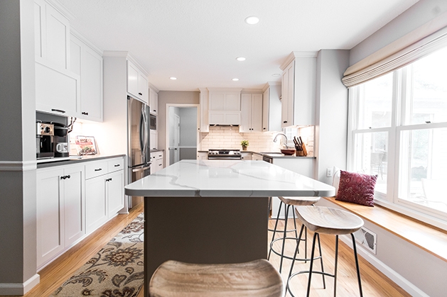
Eliminating the peninsula, the homeowner opted for an island to enhance the flow and create a more inviting layout. Placed in front of a seated window bay, it draws attention to the outdoor scenery of a wooded landscape and provides a feeling of openness with a surplus of natural light.
Featuring its own separate yet still coordinated color scheme from the surrounding cabinets, the island is painted Iron Gate gray from Benjamin Moore and is and topped with an off-white quartz countertop with natural dark gray veining. “Essentially the island becomes a piece of furniture,” Otting says.
Custom Cabinetry
A traditional shaker style cabinet with fully faced doors creates, “A simple, beautiful style that will never go out,” Otting says. Painted rather stained, the cabinetry’s classic light gray hue brings a subtle touch of color while maintaining a modernized look.
Optimal Storage
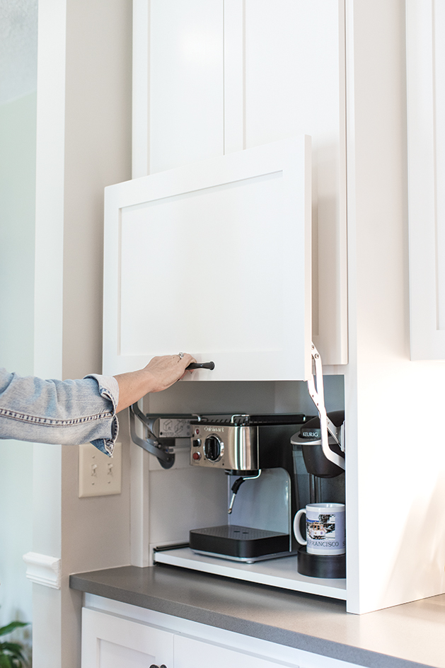
Extending the cabinets to the ceiling not only provides more storage, but also creates the illusion of a larger space. In addition to the cabinet extension is an appliance garage, pull-out trash and recycling bins and a built-in coffee bar equipped with a coffee maker and espresso machine. The appliance garage feature was a simple addition that aids in keeping more limited counter space linear and clear of the clutter.
Contributors to this Remodel
J&J Remodelers sources its services through local makers and builders including the following for this White Bear kitchen remodel:
Bear Creek Construction
Creekside Electrical Service
AJ Albert’s Plumbing
MJ’s Contract Appliance Inc.
Benchmark Cabinetry for the kitchen’s custom cabinets and island feature
Innovative Surfaces for the countertops


